Designing the system the rest of the product is built from.
At an early-stage AI company, I designed the system the rest of the product is built from, which means the visual language, the component library, and the documentation that lets the team build new things consistently. I was the only product designer, so for a while every new component had to come through me, and I started looking for a way of working that did not depend on me drawing each one by hand.
The visual design system in Figma was mostly mine to build, with help adding these components into Storybook with the engineers. A lot of how I came to think about the system underneath it came from working closely with the founder, who had been thinking this way for a while and walked me through how to step back from the screen to the structure beneath it.
Outcome
I built the system, then wrote it down so the team could build from it.
I was the only product designer on a small team, so every new component had to be designed by me first, which made me the bottleneck on how fast the product could move.
I built the design system in Figma the way atomic design lays it out, from tokens to primitives to components, moved it into Storybook with the engineers, and increasingly wrote it down as documentation so the rest of the team could build from it consistently.
New components stopped being something the team had to wait on me for. The engineers could style and build them without checking against me, which cut weeks off our development cycle.
The product was moving fast, and design couldn't keep up.
Everything design touched had a single path through it, mine. The more I sat with it, the clearer it became that this needed a different way of working rather than more of me.
I stopped designing screens and started designing the system underneath them.
This is where the way I think about design changed. Designing a system means stepping back from individual screens to the primitives, the relationships between them, and the principles that decide how they fit. The goal became a system clear enough that anyone on the team could build new things from it without breaking how the product feels. At an AI company this mattered more than it would elsewhere, because more of the product gets built from the system than drawn by hand, so the system has to carry the design judgment that used to live in each screen I made.
None of this happened in one move. It came in steps across the second half of 2025 and into 2026, each one fixing part of the problem and showing me the next piece I had not accounted for.
The Figma system
I started in the second half of 2025 with a fairly standard design system in Figma, organised the way atomic design lays it out: colour and type tokens, spacing and radii, then primitives, components and their states, and finally layouts and templates. This part I did myself, and it gave the product a consistent visual language to build from while it was still moving quickly and changing shape.
Where the tooling alone fell short
My first attempts to get out of the bottleneck leaned on the tooling. The primitives lived in code in Storybook, where I helped add them along with their docs and variants, and I connected the tokens through Figma's MCP so they stayed in sync between design and code. All of that helped, but I kept hitting the same limit: the tooling could carry what already existed, yet turning it into new screens that still fit the system routed through me and the engineers, so it did not actually unblock the team.
Rewriting it into documents
The real change was rewriting the system into a set of structured design docs the team could build from, written to carry the thinking I would have brought to each new screen myself.
Each step handed a little more of the design thinking to the system itself, until the question I was really answering stopped being how do I design this faster, and became what principle is this component based on so that anything built from it still feels like the product.
Moving the design thinking into the system itself.
The solution was less a document and more a way of organising the system so the thinking came first. Rather than fixing the product a page at a time, I started from the principles that govern how the product's design and experience should work, and let the rest follow from there.
Building it in Figma, and how it should feel
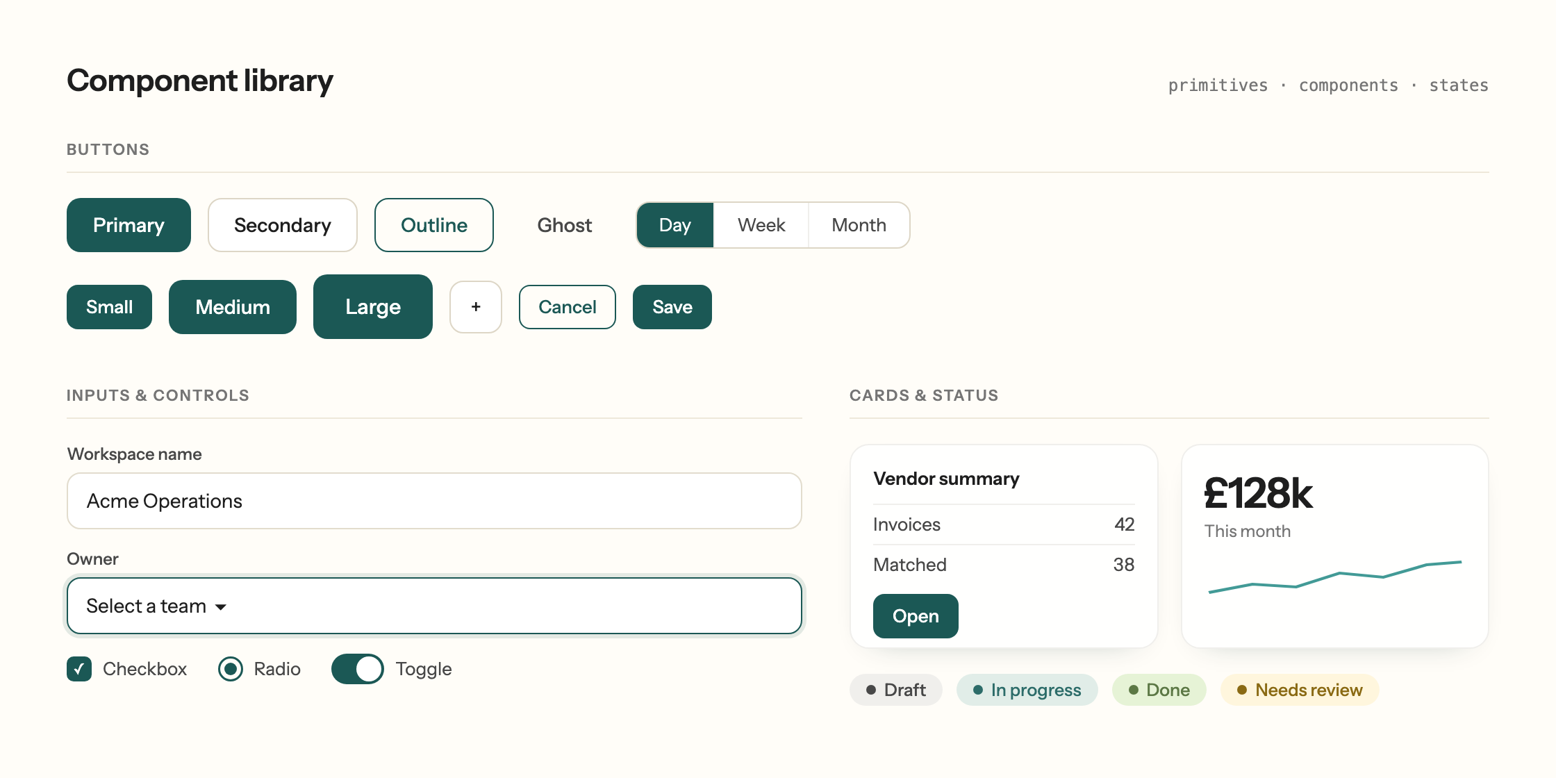
Before the documentation, a lot of the work in Figma went on branding, on how this AI platform should actually feel. I wanted a clean, calm backdrop, so I built it on a warm cream rather than a stark white, which keeps everything softer and less clinical. For the accent I went with shades of green and teal, because teal reads as trustworthy and calm, which is exactly the feeling you want from a tool people are handing real work to. For type I chose Instrument Sans, since a sans-serif carries a sense of authority while Instrument Sans keeps a slight playfulness that stops the whole thing from feeling cold. With the primitives, the styles, and the spacing set, the product had a consistent visual language to grow from.
What the docs capture
Once the look was there, the real work was writing it down so the rest of the team could build from it without routing through me. I led with the principles that govern how the design and experience behave, like motion and accessibility, and the shift I cared about most was that a colour stopped being just a hex. It became a principle, with a rule for where it belongs and where it must not go, so anything added later follows the same logic instead of being decided fresh each time. The same is true of a button, a pill, any primitive. Read together, the docs give the system enough to build something new that has the product's design and language, rather than something assembled from the right parts that does not quite hold together.
From guidelines to guardrails
Once the system was written down, a big part of my job became working out what each customer needs, like how their data should be presented, and the documentation made that much faster than hand-designing every screen. These are not guidelines that get read once and then forgotten, because they're meant to compound over time. The rules are what keep the system coherent as it grows, so anything new built from it still shares the same primitives, the same spacing, and the same sense of what each part is for. That is the heart of the systems thinking here. My job became less about deciding what every screen looks like and more about deciding what to specify and what to leave open, and trusting the system to keep the rest coherent.
For the person using the product, all of this shows up as screens that feel considered and consistent, rather than generic or overcrowded ones where they have to hunt for the one field or card that matters.
The real test was handing the system to the engineering team. They could style and build new components on their own and trust they had them right, without checking each one against me, and that is what made product move much faster.
What I'd carry into the next system I design.
Writing the design docs was not as straightforward as I expected. You cannot just take all of your Figma tokens and pour them into a document and call it done. Every principle has to be tested, you write one, you put it on a prototype, you see how it holds, and you iterate. The system only really holds up after several rounds of that, rather than on the first pass.
What worked
Designing in systems rather than screens is where I think product design is heading. The biggest thing I took away is that an AI is only ever as good as what you give it. It follows a clear principle far better than a pile of patched-up rules, so the more precisely I could write down the thinking behind a component, the better and more consistent everything the team built from it turned out. The work leaned more and more on my judgment about what actually mattered in a component, and on remembering that judgment was still mine to set, which is the part I did not expect to matter as much as it did.
What I'd do differently
I would speak to the engineers earlier about how it all gets implemented, because there was a lot I would have understood faster, and used better, by working more closely with them while the system was being written.